Japanese spring colors: a palette inspired by nature
In Japan, every season has its own colors.
These hues are not just aesthetic: they express the deep connection between nature, the passing of time, and human emotions.
Spring, in particular, is distinguished by soft, bright, and vibrant colors.
In this article, we invite you to discover the Japanese palette of spring and its traditional colors.
Japanese colors: a culture linked to nature
Traditional Japanese colors are directly inspired by nature.
Flowers, sky, plants, earth…
Every shade observed in daily life has been precisely named.
This is why Japanese colors are never neutral:
they tell the story of a season, an atmosphere, or an emotion.
The Japanese spring palette
Here are some of the iconic colors of spring in Japan.
🌸 Usuzakura (薄桜) — pale pink

A delicate pink inspired by cherry blossoms.
It symbolizes the start of spring, ephemeral beauty, and fragility.
🌿 Wakakusa (若草) — tender green

A fresh green reminiscent of young shoots.
It evokes renewal, growth, and the beginning of a new cycle.
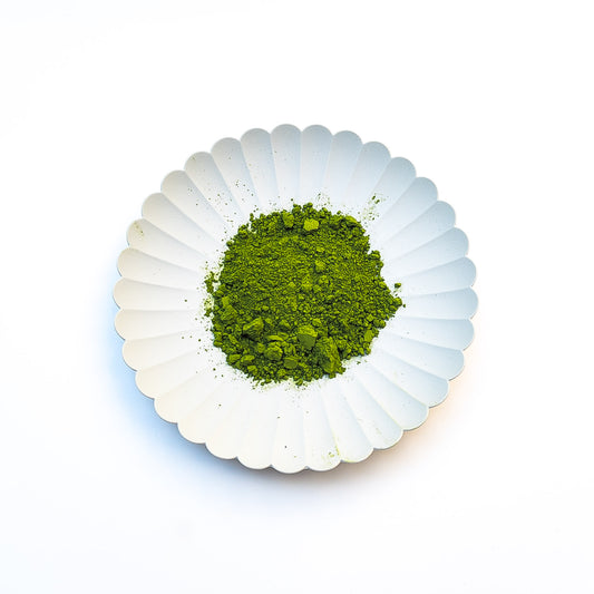
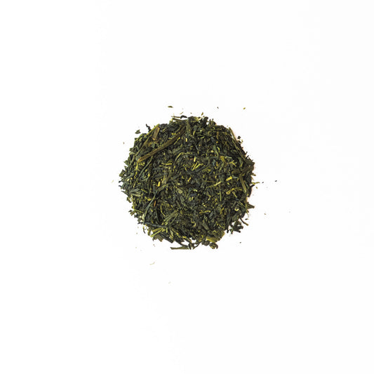
It is also a color found in Japanese matcha.
🌼 Nanohana (菜の花) — soft yellow

A bright yellow inspired by rapeseed blossoms.
It represents the light of spring and the warmth that returns.
☁️ Sorairo (空色) — sky blue

A light and soothing blue, like the sky in spring.
It evokes lightness and openness.
💜 Fuji (藤色) — light purple

Inspired by wisteria flowers, this soft purple expresses elegance and serenity.
🌸 Sumire (菫) — deep violet

A more saturated hue, inspired by small violet flowers.
It embodies a discreet and refined beauty.
🌺 Tsubaki (椿色) — deep red

An intense red inspired by camellia flowers.
It symbolizes calm strength and classic beauty.
🤍 Kinari (生成り) — natural white

A slightly creamy, untreated white.
It brings balance and softness to the entire palette.
A soft and harmonious palette
The Japanese spring palette is characterized by light, natural, and balanced colors.
Unlike highly saturated hues, these colors play with subtlety, transparency, and harmony.
It is this softness that defines Japanese aesthetics.
Incorporating Japanese colors into daily life
These colors are not limited to nature or art.
They can be found in:
- decoration
- fashion
- and even in food
For example, the green of matcha is reminiscent of wakakusa:
a lively, natural, and soothing color.
Observing colors allows one to rediscover the seasons in the details of everyday life.
Conclusion
The Japanese spring colors are an invitation to slow down and observe.
Between delicate pink, tender green, and light blue, they convey the softness of renewal.
Taking the time to notice them is already entering the spirit of the Japanese spring.